Chapter 3 Data Types and Spatial Data Models
Written by June Skeeter and Paul Pickell
In the previous chapter, we discussed some of the unique challenges associated with representing spatial data in a GIS, and how to account for these these with geographic coordinates systems and map projections. In this chapter we will discuss more broadly how to represent both spatial and non-spatial data in a Geographic Information System. We will introduce the different types of data that can represent non-spatial attributes and discuss the different scales this data can be measured on. Then we will introduce the different spatial data models we use to link the spatial and non-spatial data. Finally, we will cover some of the different file types that can be used to store data.
- Types of Spatial Phenomena
- Measurement Scales of Data: Quantitative vs. Qualitative
- Overview of Raster and Vector Data Models
- Data Resolutions
- Common File Types in GIS
Key Terms
Phenomena, Discrete Object, Continuous Field, Qualitative, Quantitative, Measurement Scale, Raster, Vector, Resolution,
3.1 Types of Phenomena
Phenomenon, noun, plural Phenomena: 1 a fact or situation that is observed to exist or happen, especially one whose cause or explanation is in question. 2 a remarkable person, thing, or event (Oxford Languages n.d.). Essentially, anything and everything are phenomenon: lightning, a country, coastlines, a dog on a kayak. Broadly speaking, in GIS we categorize phenomena as discrete or continuous. Both kinds of phenomena can be represented in a GIS, but they come with different considerations and cannot always be represented with the same kind of data model.
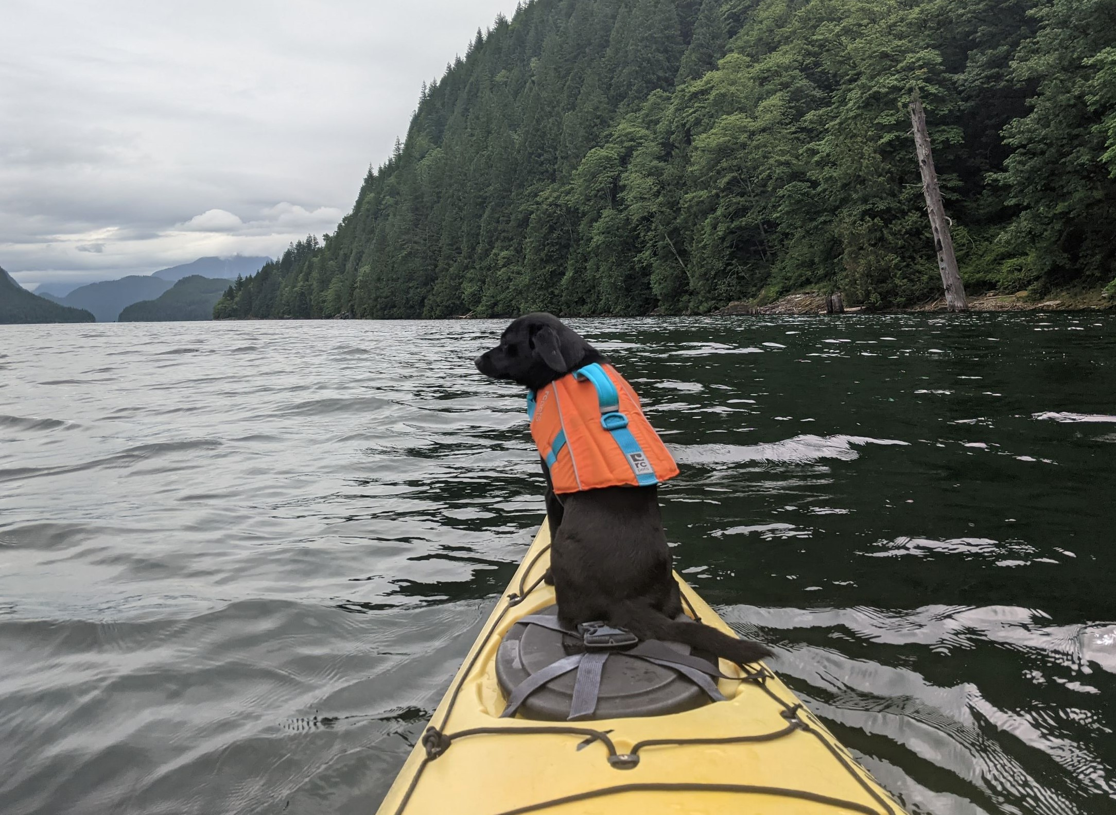
Figure 3.1: Yarrow enjoying the scenery at Aloutte Lake, she’s quite the phenomenon indeed. Skeeter, CC-BY-SA-4.0.
3.1.1 Discrete Objects
Discrete objects are finite and have distinct boundaries. Each object is a unique, self contained entity whose geography can be exactly defined. Because each object is unique and self contained, collections of objects are countable. A concrete example of a discrete objects would be buildings. They are real physical objects with well defined boundaries. We can count the number of buildings on a college campus or in a city. National and sub-national boundaries are also discrete objects. They (typically) have well defined boundaries and we can easily count the number of nations or provinces. They are not, however, real physical objects. Political boundaries are arbitrary human constructs.
Figure 3.2: Provinces are clearly delineated, distinct objects, despite having no real physical presence. Skeeter, CC-BY-SA-4.0.
3.1.2 Continuous Fields
Continuous fields are infinite and lack defined boundaries. Fields can be measured at an infinite number of locations. However, similar values tend to cluster in space so we can often make assumptions based on finite observations of continuous fields. One of the most common examples of a continuous field is elevation. This is a physical property associated with every location on earth. We can’t count the “number of elevations” because space is infinitely divisible and everywhere in space can have an elevation.
![Elevation of the Sunshine Coast in British Columbia, from the Natural Resources Canada Digital Elevation Model [@nrcan_canadian_2021].](images/03-elevation.png)
Figure 3.3: Elevation of the Sunshine Coast in British Columbia, from the Natural Resources Canada Digital Elevation Model (NRCAN 2021).
3.1.3 Imperfect Distinctions
Few phenomena will fit perfectly and exclusively into one category or the other. That said, its helpful for us to think about the discrete v. continuous dichotomy. As long as we recognize that it’s not a perfect classification. Whether a phenomenon is considered discrete or continuous depends on scale (both spatial and temporal) and perspective. Some phenomenon are a bit of both. Take the coastlines, they can be treated as discrete or continuous. At the scale of an individual beach over hours, tides can cause wide variations in water levels/position. How/where does one draw the discrete line representing the “coast”. At this scale, the coast isn’t really a discreet object, rather a continuous field known as the inter-tidal zone. Zoom out a bit and those fluctuations aren’t particularly relevant if you want to make a map of Pacific Rim National Park. The coast could be considered a discrete object. But if you change the timescale and look at sea level rise projections, then you’re dealing with a continuous field.
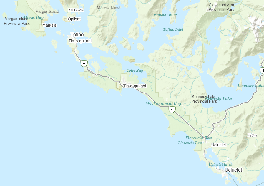
Figure 3.4: The west coast of Vancouver Island. Skeeter, CC-BY-SA-4.0.
A lightning strike is an electric discharge between the atmosphere and the ground. A lightning strike is a discrete object. The precise location of the strike can be pin pointed, the number of strikes during a storm can be counted. But what about the actual lightning bolt? That is more of a continuous field, it is not really possible to measure the exact boundaries of the path the electric discharge takes. Then we can look at other things, like the probability of lightning strikes. Figure 3.5 is a continuous field, calculated from counting discrete objects.
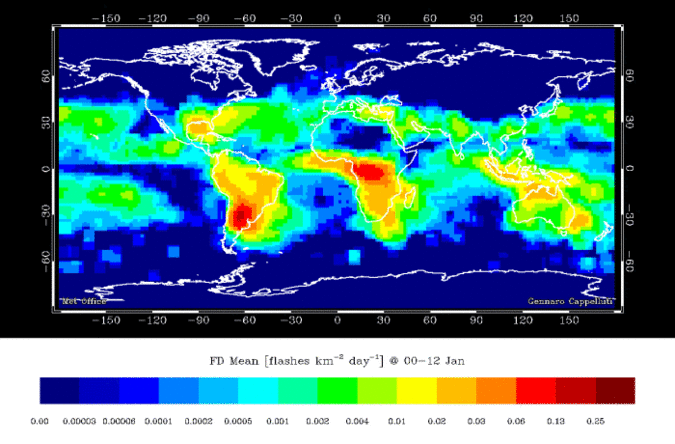
Figure 3.5: Global lightning strike density per month. Skeeter, CC-BY-SA-4.0.
3.2 Types of Data
Within the context of a Geographic Information System, each piece of information pertaining to a phenomena can be referred to as an Attribute. An phenomena can have many different attributes associated with it, but each attribute can broadly be said to address one of three questions: What, When, or Where? Attributes that describe where are known as Spatial Data while all other attributes are Non-Spatial Data. All data, spatial and non-spatial, can broadly be classified as either qualitative or quantitative. These data types are fundamentally different and are therefore measured on fundamentally different scales. The types of analysis we can conduct with qualitative data are more limited than quantitative data, but that does not necessarily mean quantitative data are “better” than qualitative.
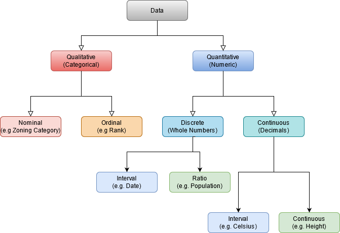
Figure 3.6: Summary of the types of data. Skeeter, CC-BY-SA-4.0.
3.2.1 Qualitative Data
Qualitative data are categorical; they are strictly descriptive and lack any meaningful numeric value. They describe the qualities of a phenomenon, without giving us any numeric information. Most qualitative data you will work with in GIS are textual or coded numerals, but there are circumstances where you may encounter non-textual data (e.g. images, sound clips, videos) in a dataset. Qualitative data can be “spatial” in nature (e.g. relative directional descriptors: left/right, near/far, north/south), but because they lack numeric values, they cannot be used for spatial analysis. Qualitative data can be measured on either a Nominal or Ordinal scale.
3.2.1.1 Nominal Scale
These are data that just consist of names or categories with no ranking or direction are nominal. One category is not more or less, better or worse than another, they are just different. A good example would be flower types. Other examples would be zoning categories, colors, flavors of ice cream, place names, etc. With nominal data, you can check for equality between entities and you can count occurrence. These are the only operations we can do. You can’t calculate
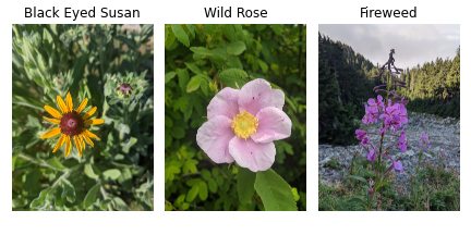
Figure 3.7: Each flower is different, but no flower is ‘more’ or ‘less’ a flower than any of the others. Skeeter, CC-BY-SA-4.0.
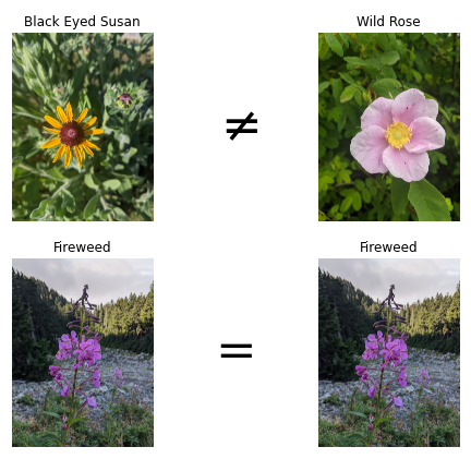
Figure 3.8: Checking equality with flower species. Skeeter, CC-BY-SA-4.0.
3.2.1.2 Ordinal Scale
Ordinal scale data are categories that also have a some ranking or directionality. A good example would be relative sizes (see Figure 3.9). Some other good examples of ordinal data include spice levels (mild, medium, hot), residential zoning density (low, medium, high), and survey responses.

Figure 3.9: We can see Yarrow is taller than her sister Shamsa, so we can rank these dogs by height. However, we haven’t measured their heights, so we don not know how much taller Yarrow is than Shamsa. Skeeter, CC-BY-SA-4.0.
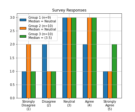
Figure 3.10: In some circumstances, we can directly calculate the median (middle value) of an ordinal set. With odd numbered sets (e.g. Group 1), the median is simply the middle value of the set, when sorted lowest to highest. We can always take the median when we have an odd number. With even numbered sets, its a bit more complicated. The median, is the average of the middle two values. For Group 2, the middle values (5th and 6th) are both ‘Neutral’, so we don’t have an issue. But for Group 3, the 5th value is ‘Neutral’ and the 6th value is ‘Agree’. We cannot directly average these two ordinal values. One solution is to arbitrarily assign a numeric score to the ordinal categories (e.g., 1-5). This would then allow you to show the median is between ‘Neutral’ and ‘Agree’. Skeeter, CC-BY-SA-4.0.
The only arithmetic operations we can do with nominal data are checking for equality (True/False), counting occurrences (frequencies), and calculating the mode (most frequent occurrence). With ordinal data, we can do these operations as well, plus a few more. We can check the order/rank (greater than, less than) and in some circumstances we can calculate the median (see Figure 3.10).
(Graded Membership) When trying to group real world phenomena into categories, there are often “exceptions” that blur the lines a bit. Take this example: you are trying to develop a land cover classification scheme for Garibaldi Provincial park in British Columbia. Some of the land surface is unquestionably alpine tundra and some is certainly forest area. However, the transition between forest and alpine meadow is not an abrupt line. How/where do you draw the line? Examples like this are known as fuzzy variables, and we often use a Graded Membership scale to assign them to categories. With the landscape classification, a simple approach would be a “winner take all” approach. If a plot is 5% bare rock, 40% forest, and 45% alpine meadow, the area will be classified as alpine meadow. From that point forward, in the GIS, that area will be treated as alpine meadow, any information about the variability within the area will be lost. In practice, many of the qualitative data we work with in GIS, especially those describing natural phenomena, are actually graded membership variables.
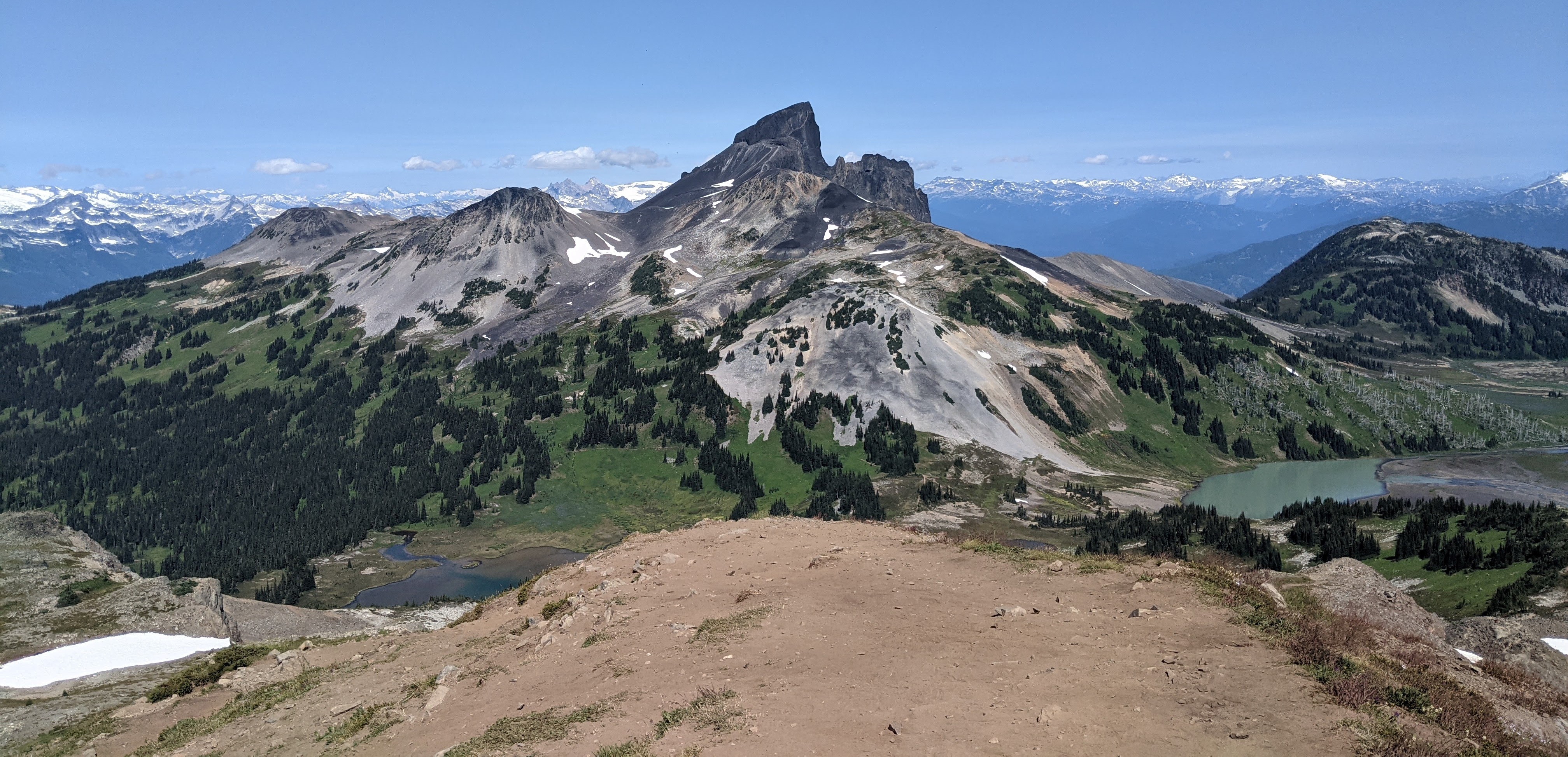
Figure 3.11: In this example, we see an alpine landscape in Garibalid Provinical Park, BC. We can see patches of forest and patches of meadow. But where, exactly, would we draw the boundary between these two landscape classes. Skeeter, CC-BY-SA-4.0.
3.2.2 Quantitative Data
Quantitative data are numeric; they describe the quantities associated with an phenomena. The numerical values that are separated by a unit that has some inherent meaning (as opposed to the arbitrary numeric codes like in the ordinal data example). This allows us to conduct a wider range of arithmetic operations on quantitative data. In addition to the operations we perform on Qualitative data; with numeric data we can always calculate measures of central tendency (mean/median) and we can add/subtract values to calculate differences.
Numeric data can be either discrete or continuous. Discrete variables (e.g. population) are obtained by counting and values within a range cannot be infinitely subdivided. You can have a population of 1, 37, or 179 but you cannot have a population of 2.3. Continuous variables (e.g. temperature) can take an infinite number of values a given range, but they cannot be counted. You can have temperatures of 10, 10.5, or 10.1167 °C, but a temperature of 10°C does not mean you have 10 individual degrees of temperature. Quantitative data (both discrete and continuous) can be measured on either an Interval or Ratio scale. These types of quantitative data are closely related, but have one important distinction.
3.2.2.1 Ratio Data
Ratio data have fixed, meaningful, absolute zero points. The absolute zero point means ratio data cannot take negative values. It also means that we can multiply/divide two values to calculate a meaningful ratio between them (hence the name). A good example of ratio data are population total (see figure). Population counts start at zero and go up from there. A population of zero means there are no residents, and its impossible to have a negative population. Other examples of ratio data include: temperature (in degrees Kelvin), precipitation, tree height, income, rental cost, and units of time (years, seconds, etc.)
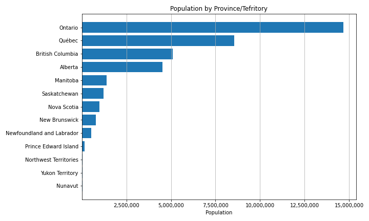
Figure 3.12: Because of the fixed, meaningful zero point, we can calculate ratios between populations: e.g. Manitoba’s population is 1/10th that of Ontario, British Columbia has 129 times as many people as Nunavut. Skeeter, CC-BY-SA-4.0.
Interval data on the other hand, have an arbitrarily set zero point. This means they can can take negative values. Because the zero point is arbitrary, we cannot multiply/divide two values or calculate meaningful ratios between two values. A good example of interval data is temperature measured in Celsius, and comparing it to Kelvin highlights the difference between the two data types (see Figure 3.13). The conversion between Kelvin (K, ratio) and Celsius (C, interval) is very simple: \(^\circ\)C = K-273.15. Zero Kelvin is “Absolute Zero” or the lack of temperature, while 0\(^\circ\)C is the freezing point of water (273.15 K above absolute zero). Other examples of interval data include: the pH scale, IQ test scores, elevation (relative to a datum) dates (April 12th, 2011), and times (11:00 A.M.).
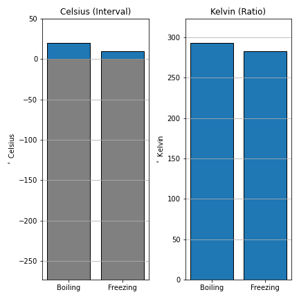
Figure 3.13: The ratio between two temperatures in Celsius is not meaningful, 20 C is not ‘twice’ as warm as 10 C. Kelvin’s zero point is fixed to absolute zero, the ‘absence’ of temperature. So we can calculate the ratio, 293.15 K is 1.035 times warmer than 283.15 K. Skeeter, CC-BY-SA-4.0.
3.2.3 Derived Ratio: Normalizing Data
Sometimes we want to account for the influence of one variable when analyzing another. To do this, we can divide one value by by another to get the ratio of the two, also known as a derived ratio. This process is sometimes referred to as Normalizing or Standardizing our data. The basic formula is: \(C=\frac{A}{B}\), where A is our variable of interest, B is our confounding variable, and C is our new derived ratio. There are many circumstances where we might need to do this. One common example is population density: Canada and Poland both have populations of ~ 38 million people but Canada had 32x the land area of Poland. Any comparison of the these two nations that fails to account for the size disparity would be seriously flawed. Another key example are affordability indexes. The example below shows how normalization can be applied to a households expenditures on food. Income and household expenditures on food are strongly related (wealthy regions tend to purchase more expensive food). An analysis of the cost of food that does not account for this relationship would not adequately account for the affordability of food in a given region. Dividing household food expenditures by household income, we get the proportion of income spent on food. This is a much more accurate representation of the affordability of food and highlights that the poorest communities are most severely impacted by increasing food costs.
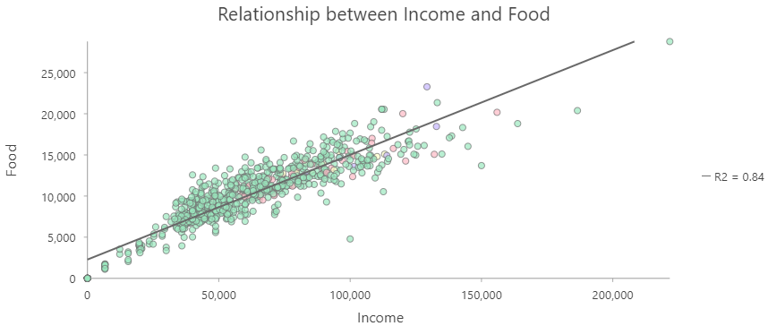
Figure 3.14: Income versus household expenditures on Food by Census Subdivisions in British Columbia. Skeeter, CC-BY-SA-4.0.
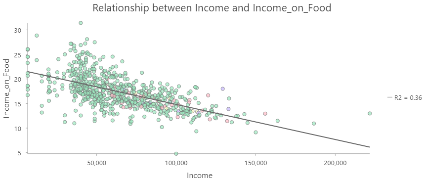
Figure 3.15: Income versus Fraction of Income Spent on Food by Census Subdivisions in British Columbia. Skeeter, CC-BY-SA-4.0.
3.3 Spatial Is Special
You might encounter the phrase “Spatial is special” in your time studying GIS. Spatial data is the foundation of Geographic Information Science, it is what distinguishes GIS from the broader field of data science. This was succinctly summarized by Waldo Tobler in The First Law of Geography: - “Everything is related to everything else, but near things are more related than distant things.”
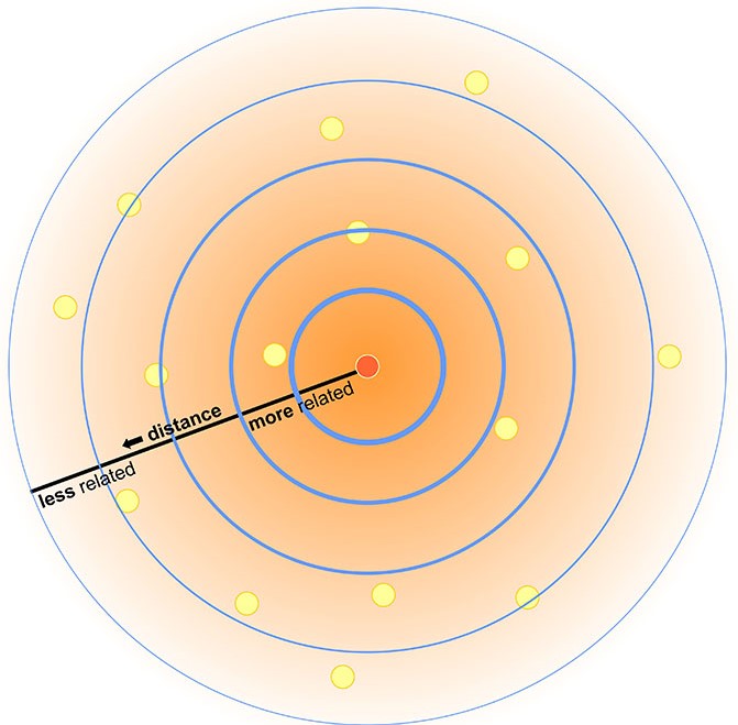
Figure 3.16: Visualization of Tobler’s First Law. Skeeter, CC-BY-SA-4.0.
This might seem obvious: people interact more if they live in the same city, orca pods in different areas develop different dialects, hemlocks on Vancouver Island are more related to their neighbors than to to hemlock in the New Brunswick. Generally, near things are more related to one another, but it does not guarantee similarity. Downtown Vancouver averages 40 cm of snow/year, but the ski resort on Grouse Mountain 15 km north gets over 9 m. These locations are impacted by the same storm systems, but the 1200 m elevation difference causes vastly different quantities and different types of precipitation.
The measure of similarity between objects across space called spatial autocorrelation. Spatial autocorrelation allows us to make some a key assumptions when representing spatial data. We don’t have to measure a phenomena everywhere in order to represent it adequately. We only need to measure it at specific locations or over regular intervals. If point A is in dense forest, it is likely point B 10 m away is also in a dense forest. We do not have to get the location of every tree in the forest. Instead, we can look at the average presence of trees over a larger area.
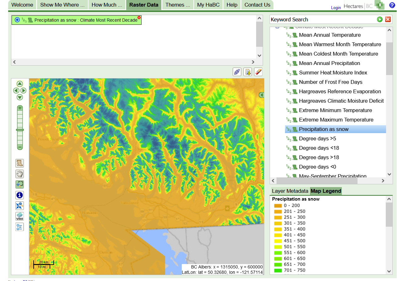
Figure 3.17: Screengrab from Hectares BC, can easily make into better map. Skeeter, CC-BY-SA-4.0.
3.4 Spatial Data Models
As discussed in the previous chapter, spatial data is three-dimensional, though we usually project it into two-dimensions for simplicity. Because of the unique transformations that must be applied to spatial data, it must be treated and represented differently than the non-spatial data that describe what is happening and when. We cannot simply put all of our data into a spreadsheet and start analyzing it. We have to use Spatial Data Models to organize our data and link our spatial and non-spatial data. Spatial data models store geographic data in a systematic way so that we can effectively display, query, edit, and analyze our data within a GIS.
There are two main types of spatial data models: the Raster and Vector models. The raster data model represents spatial data as grid of cells, and each cell has one non-spatial attribute associated with it. The vector data model represents spatial data as either points, lines, or polygons that are each linked to one or more non-spatial attributes. These two models represent the world in fundamentally different ways. One is not inherently better than the other, but they are better suited for different circumstances. The choice of which model to use is often dictated by three main factors:
- The type of phenomena we are trying to represent.
- The scale at which we plan to analyze our data.
- How we plan to use the data.
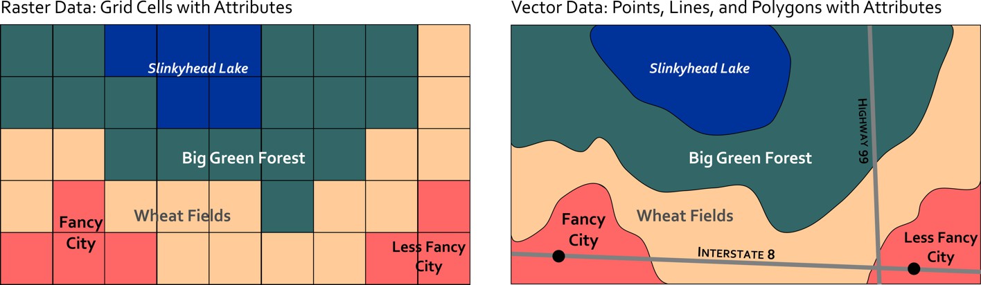
Figure 3.18: Representing space in the raster model vs. the vector model. Skeeter, CC-BY-SA-4.0.
3.4.1 Raster Data Model
The raster data model represents a phenomena across space as a gridded set of cell (or pixels). The cell size determines the Resolution of the raster image, that is the smallest feature we can resolve with the raster. A 10 m resolution raster has cells that are 10 x 10 m (100 m2), a 2 m resolution has cells that are 2 x 2 m (4 m2). Along with the cell size, the number of rows and columns dictates the extent (or bounds) of a raster image. A raster with a 1 m cell size, 5 rows, and 5 columns, will cover an area of 5 m x 5 m (25 m2). Because of the full coverage within their bounds, raster data models are very well suited for representing continuous phenomena where cell values correspond to measured (or estimated) value at specific location. In GIS, rasters are commonly encountered as: satellite and drone imagery, elevation models, climate data, model outputs, and scanned maps.
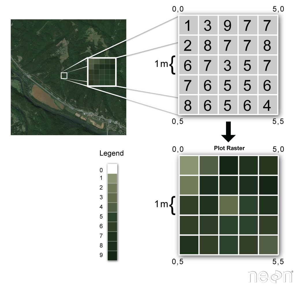
Figure 3.19: Example of raster data. Skeeter, CC-BY-SA-4.0
The value of a pixel can be quantitative (e.g. elevation) or qualitative (e.g. land use). Each pixel/cell can only have a single value associated with it. Multiple bands can be combined to store or more information, as is done with a RGB color photograph. Algebraic expressions can also be performed quickly and efficiently with raster layers a inputs. This is known as raster overlay, and is one of the key advantages to raster data. If layer A = Average July Temperature and layer B = Average January Temperature, then A – B will give us the Average Temperature Range across the rasters domain.
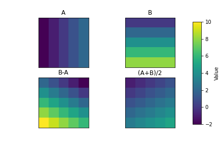
Figure 3.20: Raster math illustration. Skeeter, CC-BY-SA-4.0.
Rasters data relies on Spatial Autocorrelation and The First Law of Geography, the model assumes that all areas within a given cell are equally represented by the cell value. Depending on the resolution of the raster and the scale of the task at hand, this may or may not be an effective assumption. If you are trying to represent the coastline of Nova Scotia, 100 m or even 1 km resolution cells will likely suffice (see Figure 3.21). However, 10 km cells severely degrade the quality of the representation and at a 100 km cell size, the province is indistinguishable.
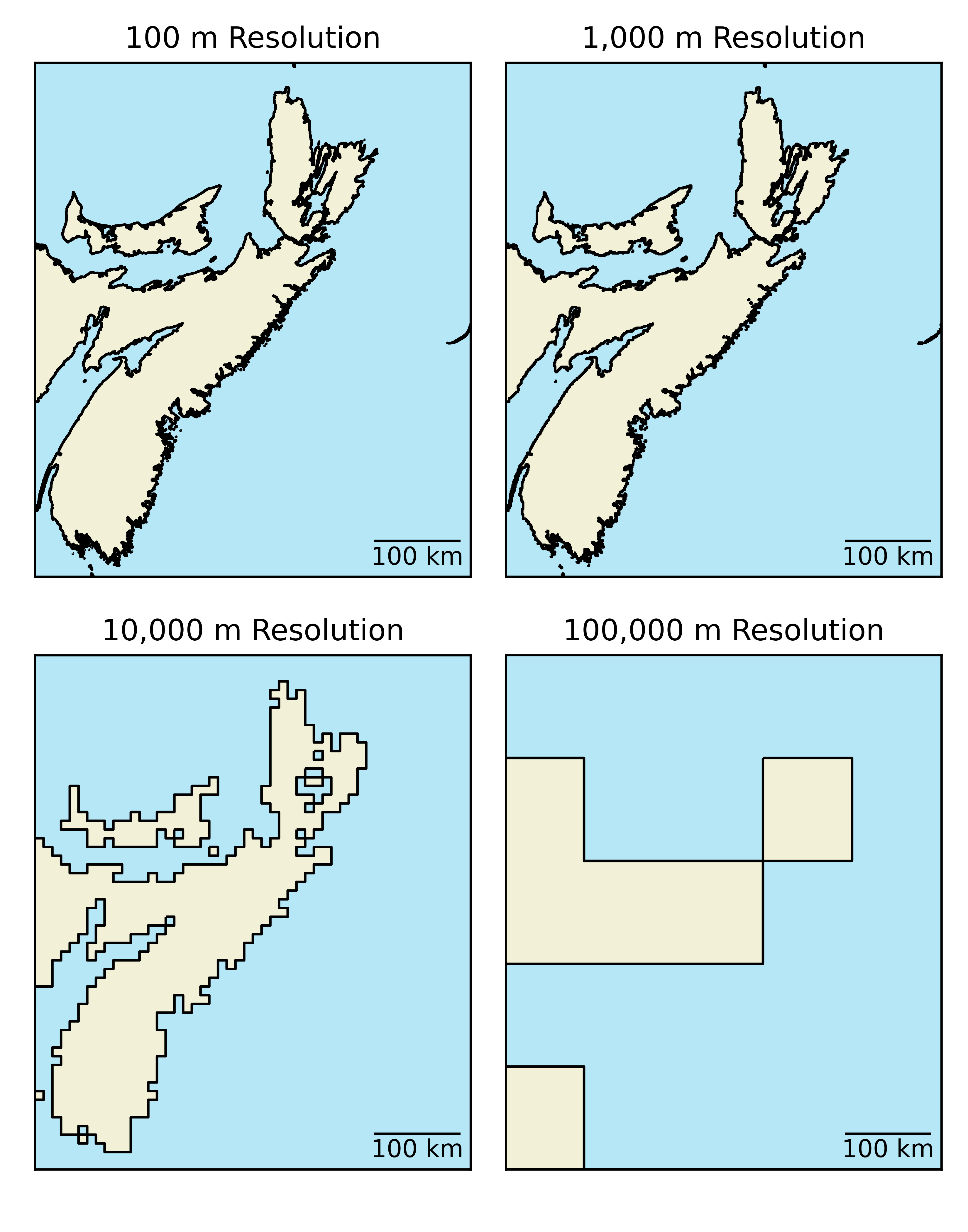
Figure 3.21: Raster Resolution. Skeeter, CC-BY-SA-4.0.
The above example is related to something known as them mixed pixel problem. Each cell in a raster can only have one value. So how do you handle when the area a cell covers contains multiple examples. Possible approaches are:
Majority/Mode, the cell value is determined by the value/class covering the largest area within each cell. This can be useful for discrete phenomena, but generally will not be helpful for continuous phenomena.
Touches All, can be useful for discrete phenomena if you need to prioritize specific class(es) you can designate it them to be assigned to any pixel the touch (e.g., with flood/fire risk or most other hazards, you want to take an inclusive approach when defining risk zones. Better safe than sorry.)
Nearest Neighbor/Center Point, the cell value is determined by the value/class only at the center point of the cell. This method is quick to calculate but can under- or over-estimate repeating phenomena with frequencies lining up with the raster resolution (e.g., City Blocks/Roads, rows in agricultural fields).
Average, when working with continuous phenomena (e.g., rainfall, temperature, elevation) it might be best to use the average value across the cell instead. If multiple observations are available calculate the spatially weighted average within each cell. If we are working with discrete phenomena, this method is generally less useful.
When the data resolution is very high, relative to the scale of the map/analysis, the specific choice of method will produce negligible differences. If you are working with a 25 m resolution land cover classification and doing a continental scale analysis, the improper attribution of boundary pixels will not have a huge impact on the results. If the data resolution is low relative to the scale of your analysis, the choice of method could have a significant impact on your results.
Raster data can come in many different formats. GeoTIFF which has the extension .tif is one of the most common. This format is based of the Tag Image File Format (TIFF), a common file type used by graphic artists and photographers. A TIFF file stores metadata (data about the data) as tags. For instance, your camera might store a tag that describes the make and model of the camera and another for the date the photo was taken when it saves a picture. A GeoTIFF is a standard .tif image format plus additional tags spatial tags denoting spatial information including:
- Extent (minimum x,y and maximum x,y)
- Resolution (cell size)
- Projection, Coordinate system, and datum
Other file types you will likely encounter when working with raster data include:
- IMG - A proprietary image format commonly used by ESRI products
- JPEG2000 - A geospatial version of the common .jpg image type
- ASCII - An older human readable format (simple text file) with slower performance than the types listed above.
3.4.2 Vector Data
The vector data model is much more well suited to represent discrete phenomena than the raster data model. A vector feature is a representation of a discrete object as a set of x,y coordinate pairs (points) linked to set of descriptive attribute about that object. A vector feature’s coordinates can consist of just one (x,y) pair to form a single point feature, or multiple points which can be connected to form lines or polygons (see Figure 3.22). The non-spatial attribute data is typically stored in a Tabular format separate from the spatial data, and it is linked using an index. One of the key advantages of the vector model is the ability to store and retrieve many attributes them quickly. In GIS, vector data are commonly encountered as: political boundaries, cenus data, pathways (road, trails, etc.), point location (stop sign, fire hydrant), etc.
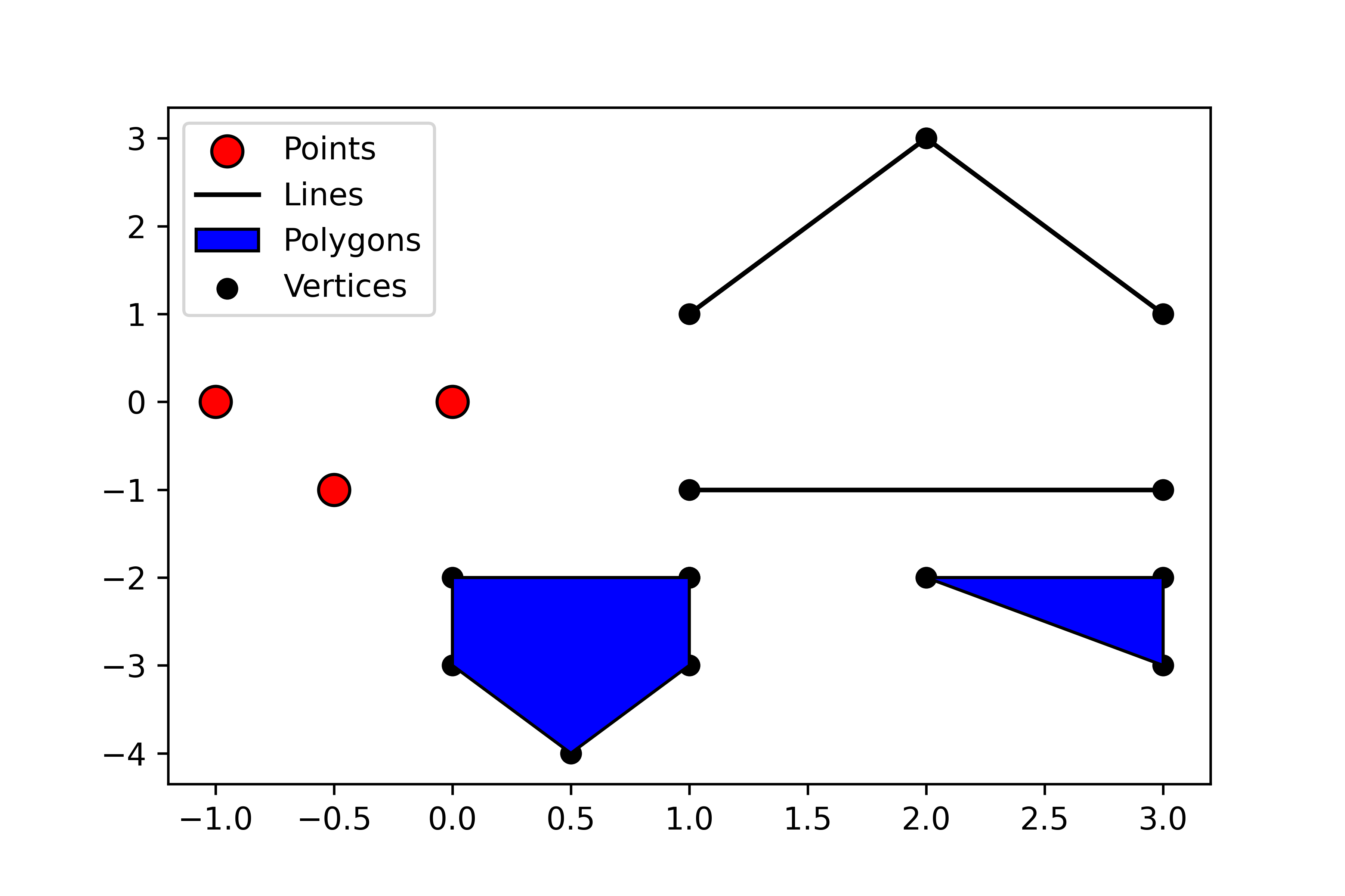
Figure 3.22: Vector objects (points, lines, or polygons) are stored along with any number of attribute. Point, line, and polygon data are typically stored in separate files. Skeeter, CC-BY-SA-4.0.
Points are “zero-dimensional”, they have no length or width or area. A point feature is just an individual (x,y) coordinate pair representing a precise location, that has some linked attribute information. Points are great for representing a variety of objects, depending on the scale. Fire hydrants, light poles, and trees are suitable to be represented as points in almost any application. If you are making a map of mines in British Columbia, or cities across Canada, it is probably acceptable to just display them as points.
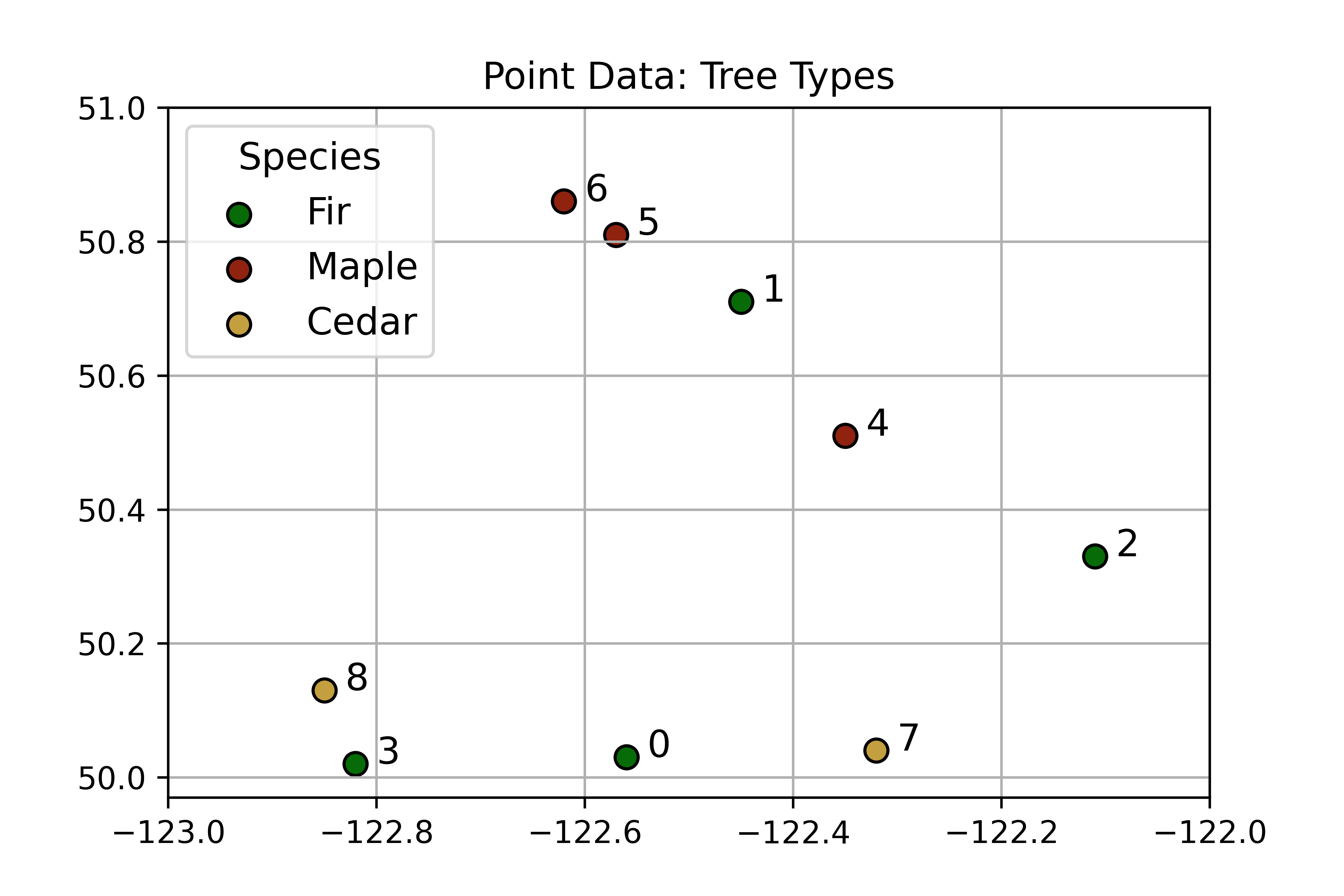
Figure 3.23: An example of point data showing locations of trees. The points are labeled with their index (unique ID number) which correspoonds to the attribute table below which stores more information about eacht tree. Skeeter, CC-BY-SA-4.0
| index | Longitude (X) | Latitude (Y) | Name | Age | Height |
|---|---|---|---|---|---|
| 0 | 0.44 | 0.03 | Fir | 54 | 119 |
| 1 | 0.55 | 0.71 | Fir | 29 | 56 |
| 2 | 0.89 | 0.33 | Fir | 82 | 197 |
| 3 | 0.18 | 0.02 | Fir | 46 | 98 |
| 4 | 0.65 | 0.51 | Maple | 87 | 212 |
| 5 | 0.43 | 0.81 | Maple | 73 | 172 |
| 6 | 0.38 | 0.86 | Maple | 94 | 233 |
| 7 | 0.68 | 0.04 | Cedar | 34 | 68 |
| 8 | 0.15 | 0.13 | Cedar | 36 | 73 |
Lines are one-dimensional, they have length, but no width and thus no area. A line consists of two or more points. Every line must have a start point and end point, they may also have any number of middle points, called vertices. A vertex is just any point where two or more lines meet. Lines are also great for representing a variety of objects, depending on the scale. Hiking trails, flight paths, coastlines, and power lines are suitable to be represented as lines in almost most applications. When making smaller scale maps, it is often sufficient to represent rivers as lines, though at large scales we might elect to use a polygon.
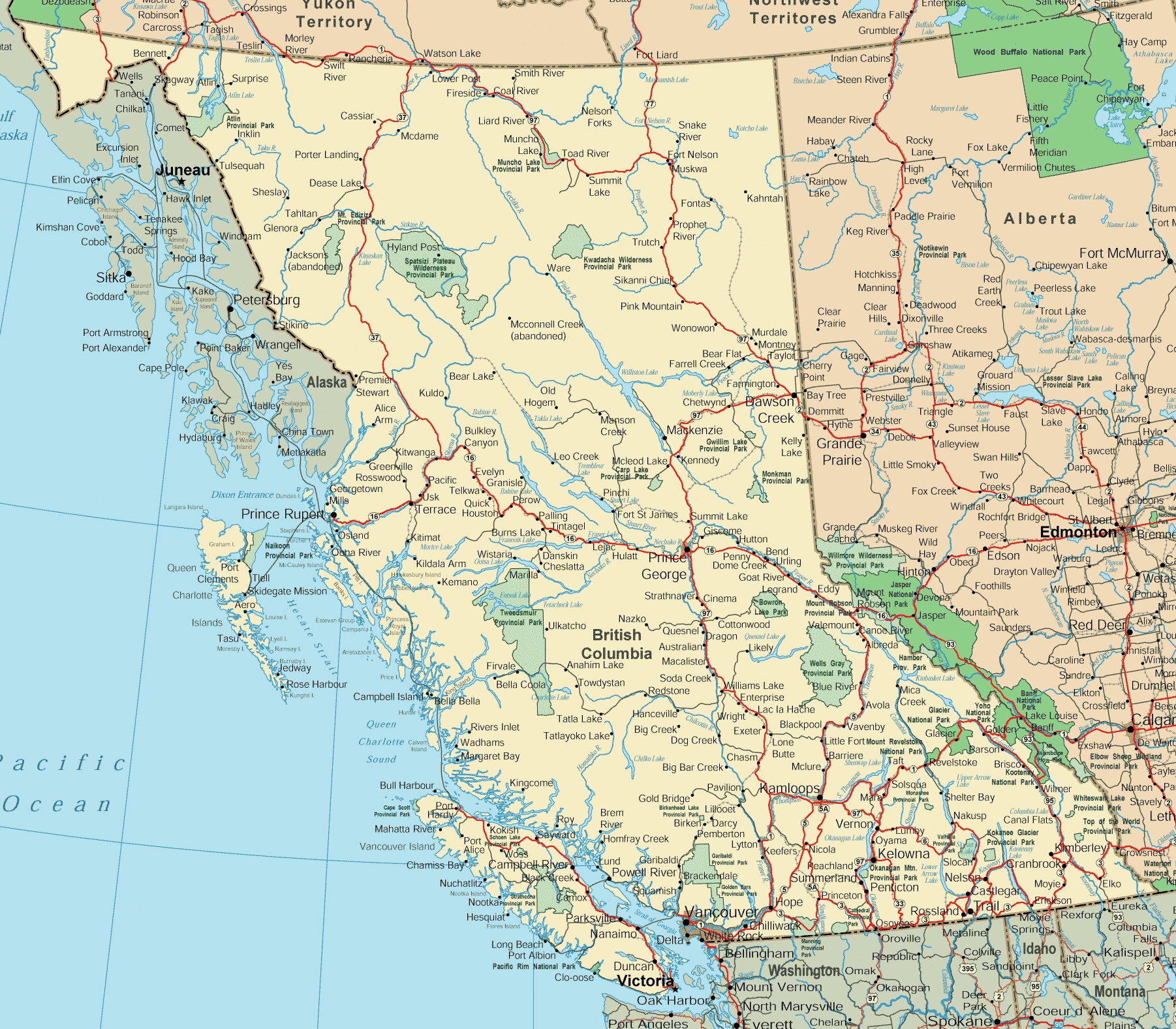
Figure 3.24: Roads are typically reprented as line data. Though they obviously have an area, unless we are making a very large scale map, we do not need (or have the room) to show that on a map. This British Columbia road altlas makes use of line data, representing roads a lines and using different colors to denote the type of road. Skeeter, CC-BY-SA-4.0.
Polygons are two-dimensional, they have both a length and width and therefore we can also calculate their area. All polygons consist of a set of at three or more points (vertices) connected by line segments called “edges” that connect to form an enclosed shape. All polygons form an enclosed shape, but some can also have “holes” (think doughnuts!), these holes are sometimes called interior rings. Each interior ring is a separate set vertices and edges that is wholly contained within the polygon and no two interior rings can overlap. Polygons are useful for representing many different objects depending: political boundaries boundaries, Köppen climate zones, lakes, continents, etc. At large scales they can represent things like buildings which we might choose to represent as points at smaller scales.
Sometimes, a discrete object has multiple parts, that are spatially separated. In these circumstances, the vector model allows for multi-polygon, multi-line, or multi-point objects. A good example of when a multi-polygon would be useful is the StatsCanada provincial boundary file (see Figure 3.25). Roads sometimes need to be stored as multi-lines as well, for example Highway 1 crosses the Georgia Straight from Vancouver to Nanaimo. If we want the to represent the entire Highway as one object, we need to use a multi-line.
Figure 3.25: This is the official Stats Canada provincial boundary layer. All the other coastal provinces and territories have islands. We do not need to represent every island as a separate object, so we can ‘bundle’ together the polygons as multipolygons. The landlocked provinces do not have any coastlines and are represented as simple polygons reather than multipolygons. The attribute table bellow corresponds to the map and lists the geometry type (polygon/multipolygon). Skeeter, CC-BY-SA-4.0
| PRNAME | Province ID | Population | Area | Geometry Type |
|---|---|---|---|---|
| Newfoundland and Labrador | 10 | 525572 | 373872 | MultiPolygon |
| Prince Edward Island | 11 | 157329 | 5660 | MultiPolygon |
| Nova Scotia | 12 | 971451 | 53338 | MultiPolygon |
| New Brunswic | 13 | 779940 | 71450 | MultiPolygon |
| Quebec | 24 | 8536855 | 1365128 | MultiPolygon |
| Ontario | 35 | 14666590 | 917741 | MultiPolygon |
| Manitoba | 46 | 1389952 | 553556 | MultiPolygon |
| Saskatchewan | 47 | 1206019 | 591670 | Polygon |
| Alberta | 48 | 4511223 | 642317 | Polygon |
| British Columbia | 59 | 5111756 | 925186 | MultiPolygon |
| Yukon | 60 | 41774 | 474391 | MultiPolygon |
| Northwest Territories | 61 | 45217 | 1183085 | MultiPolygon |
| Nunavut | 62 | 39419 | 1936113 | MultiPolygon |
Vector data also has a resolution although it has a somewhat different definition in the context of the vector model. Vector resolution is determined by the smallest resolvable feature. Another way to describe vector resolution, would be the distance between vertices. The greater the distance between vertices, the fewer vertices there are per polygon and the lower the resolution. If a vector object (line or polygon) has many vertices, we will have a higher resolution representation of the feature.
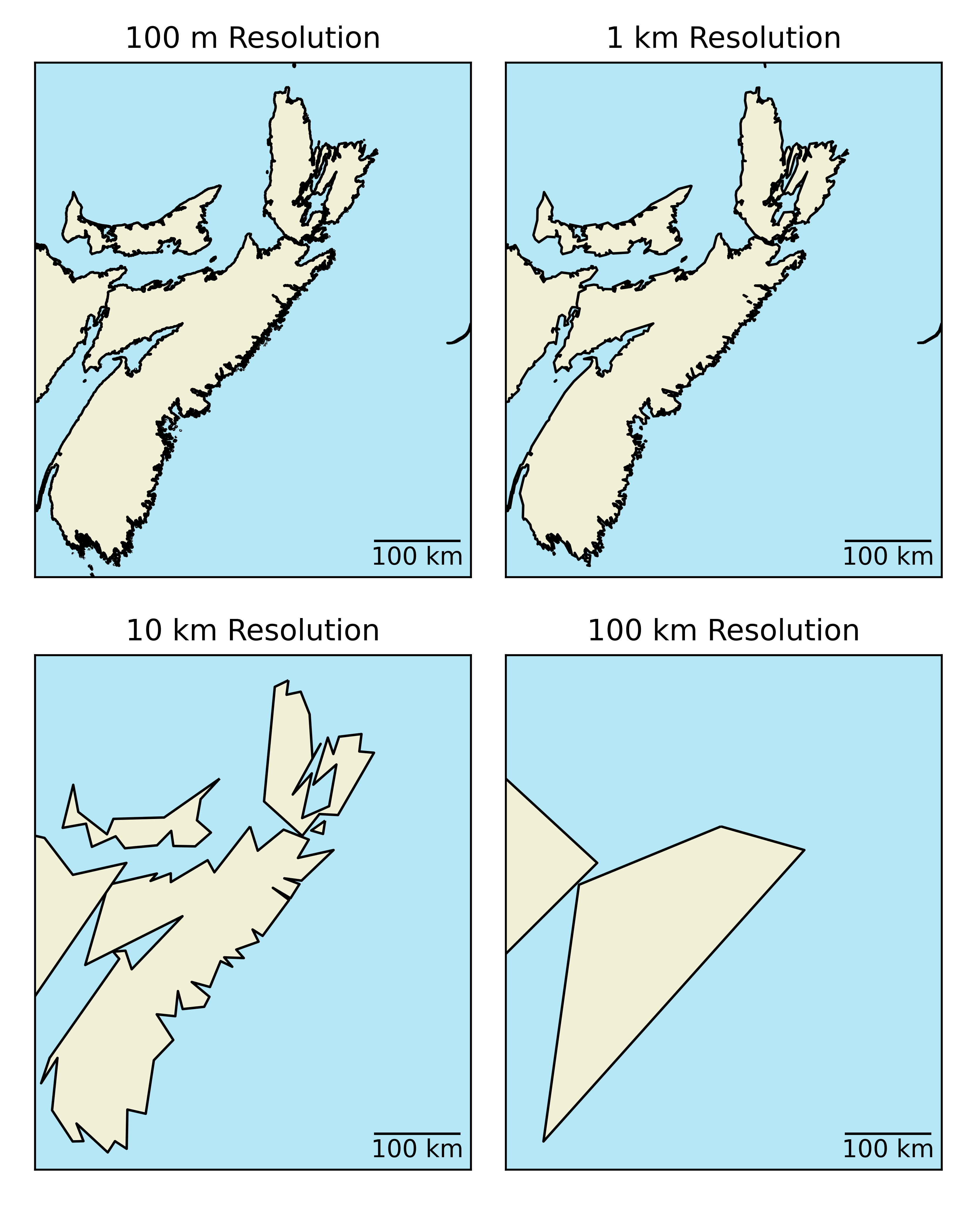
Figure 3.26: Vector image of Nova Scotia at different resolutions. Here the original polygon (top left) has been downsampled to lower resolutions, by setting the minimum allowable distance between verticies. As the distance beween vercicies increases, the resolution decreases and the coastline becomes less distinguishable. Skeeter, CC-BY-SA-4.0.
3.4.2.1 File Types
Like raster data, vector data can also come in many different formats. The shapefile format which has the extension .shp is one of the most common file types you will encounter. A shapefile stores the geographic coordinates of each vertex in the vector, as well as metadata including:
- The spatial extent of the shapefile (i.e., geographic area that the shapefile covers). The spatial extent for a shapefile represents the combined extent for all spatial objects in the shapefile.
- Object type - whether the shapefile includes points, lines, or polygons.
- Coordinate reference system (CRS)
- Attributes - for example, a line shapefile that contains the locations of streams, might contain the name of each stream.
Because the structure of points, lines, and polygons are different, each individual shapefile can only contain one vector type (all points, all lines or all polygons). You will not find a mixture of point, line and polygon objects in a single shapefile.
GeoJSON is a simple, lightweight format for storing a variety of geographic data structures. It is most commonly encountered in web mapping and other open source applications. GeoJSON supports the following geometries: Point, Line, Polygon, MultiPoint, MultiLine, and MultiPolygon objects. Unlike with shapefiles, one GeoJSON file can contain any mix of geometries. An objects with and its attributes are a Feature object. A set of Features is a FeatureCollection. GeoJSON has the added benefit of allowing you to encode stylistic choices within the file. If you would like to explore this format a bit more, copy the code below and paste it in the online GeoJSON editor geojson.io. You can make changes and see them reflected on your the map.
{
  "type": "FeatureCollection",
  "features": [
    {
      "type": "Feature",
      "properties": {
        "marker-color": "#blue",
        "marker-size": "medium",
        "marker-symbol": "circle",
        "Name": "Vancouver"
      },
      "geometry": {
        "type": "Point",
        "coordinates": [
          -123.04687499999999,
          49.23912083246698
        ]
      }
    },
    {
      "type": "Feature",
      "properties": {
        "marker-color": "red",
        "marker-size": "medium",
        "marker-symbol": "square",
        "Name": "Victoria"
      },
      "geometry": {
        "type": "Point",
        "coordinates": [
          -123.40942382812501,
          48.516604348867475
        ]
      }
    }
  ]
}
Simple text files are human readable file formats (.txt, .csv) that are suitable for storing point and attribute data. You will often encounter .txt or .csv files when working with weather data for instance. Coordinates (typically latitude and longitude) are stored in a text files along with the other attributes. We can bring this type of file into a GIS, but we need to convert the data to point features before we can display it.
Canadian Weather Station File
| Name | Province | Climate ID | Latitude (Decimal Degrees) | Longitude (Decimal Degrees) |
|---|---|---|---|---|
| ACTIVE PASS | BRITISH COLUMBIA | 1010066 | 48.87 | -123.28 |
| ALBERT HEAD | BRITISH COLUMBIA | 1010235 | 48.40 | -123.48 |
| BAMBERTON OCEAN CEMENT | BRITISH COLUMBIA | 1010595 | 48.58 | -123.52 |
| BEAR CREEK | BRITISH COLUMBIA | 1010720 | 48.50 | -124.00 |
| BEAVER LAKE | BRITISH COLUMBIA | 1010774 | 48.50 | -123.35 |
| BECHER BAY | BRITISH COLUMBIA | 1010780 | 48.33 | -123.63 |
| BRENTWOOD BAY 2 | BRITISH COLUMBIA | 1010960 | 48.60 | -123.47 |
| BRENTWOOD CLARKE ROAD | BRITISH COLUMBIA | 1010961 | 48.57 | -123.45 |
| BRENTWOOD W SAANICH RD | BRITISH COLUMBIA | 1010965 | 48.57 | -123.43 |
| CENTRAL SAANICH VEYANESS | BRITISH COLUMBIA | 1011467 | 48.58 | -123.42 |
3.5 Choice of Spatial Data Model
There is no “best” spatial data model. Rasters are more well suited for some applications and vector data are better suited for others. The section summarizes some of the key considerations that influence which model is suited for which situations.
3.5.1 Comparing Data Models
| Vector | Raster |
|---|---|
| Usually discrete objects | Usually continuous fields |
| Points, Lines, and/or Polygons | Grid of cells (pixels) with continuous coverage |
| Each object can have many attributes | Each cell has one value per band (layer) |
| Objects may overlap, have gaps, or be continuous | One raster image can have many bands |
3.5.2 Raster Data Model
| Advantages | Disadvantages |
|---|---|
| Well suited for continuous variables: in space and time | Large file size: exponentially proportional to resolution and linearly proportional to number of bands. |
| Simple data structure makes overlay is easy and efficient | Loss of information during rasterization (mixed pixel problem, see case study). Reductions in cell size may lead to inability to recognize spatial features. |
3.5.3 Vector Data Model
| Advantages | Disadvantages |
|---|---|
| Compact data structure: smaller file sizes | Complex data structures compared to rasters |
| A good representation of discrete objects | Topology (connectivity) - can be a huge head ache when creating a layer |
| Easy to query and select by attributes | Some tasks (overlay of layers) can be computationally expensive |
| Graphic output is usually more aesthetically pleasing | No variability within polygons possible |
| Topology (connectivity) - Proximity & Network Analysis | Less suited for continuous variables (requires significant generalization) or temporal change |
3.5.4 Which Data Model is Best?
No single data model is suitable for all types of data or analysis.
- Most GIS systems employ both raster and vector data structures so that the user can choose the model best suited to the representation of their data
- It is possible to convert back and forth between models
- However, this results in a loss of information and may introduce additional error each time a conversion is made